FSW Cafe
Location: Taipei, Taiwan
Completion: 2021
I drew a line for you
What a thing to do
And it was all yellow"
-Coldplay, Yellow
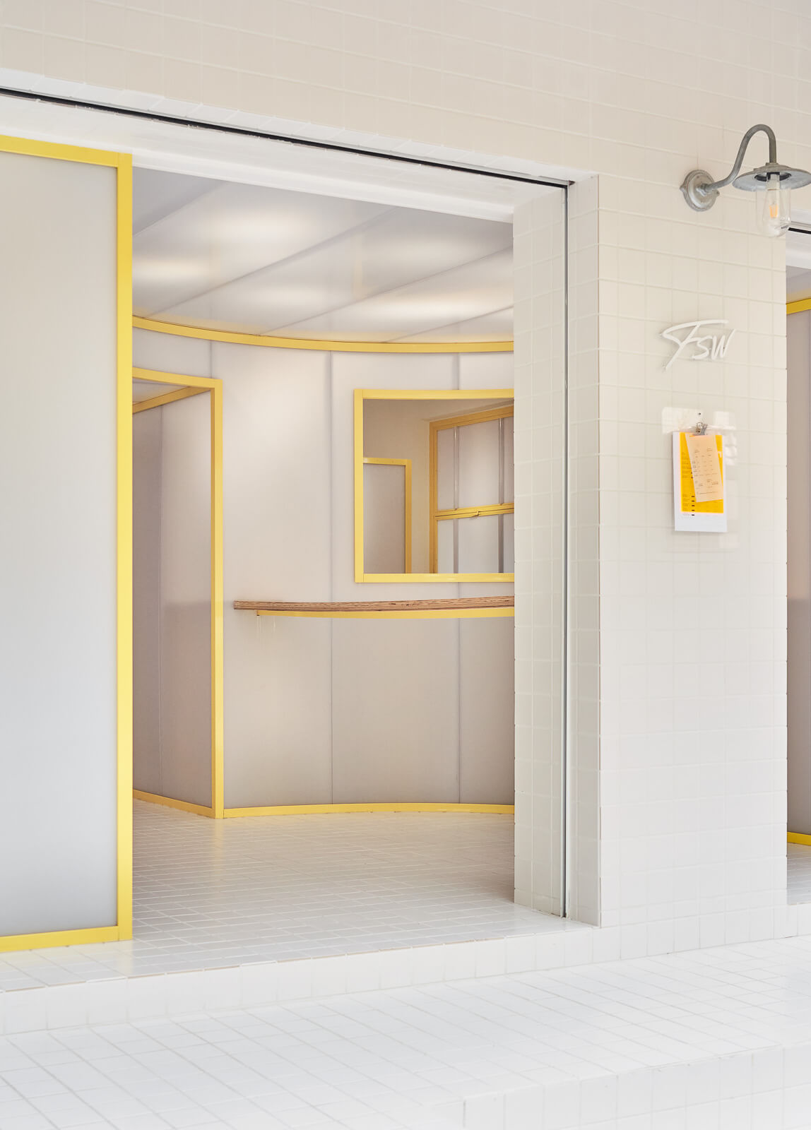
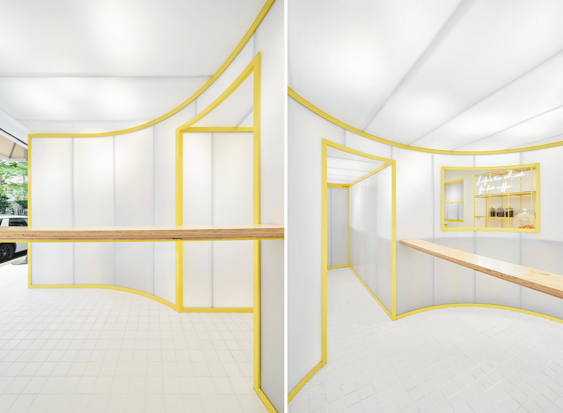
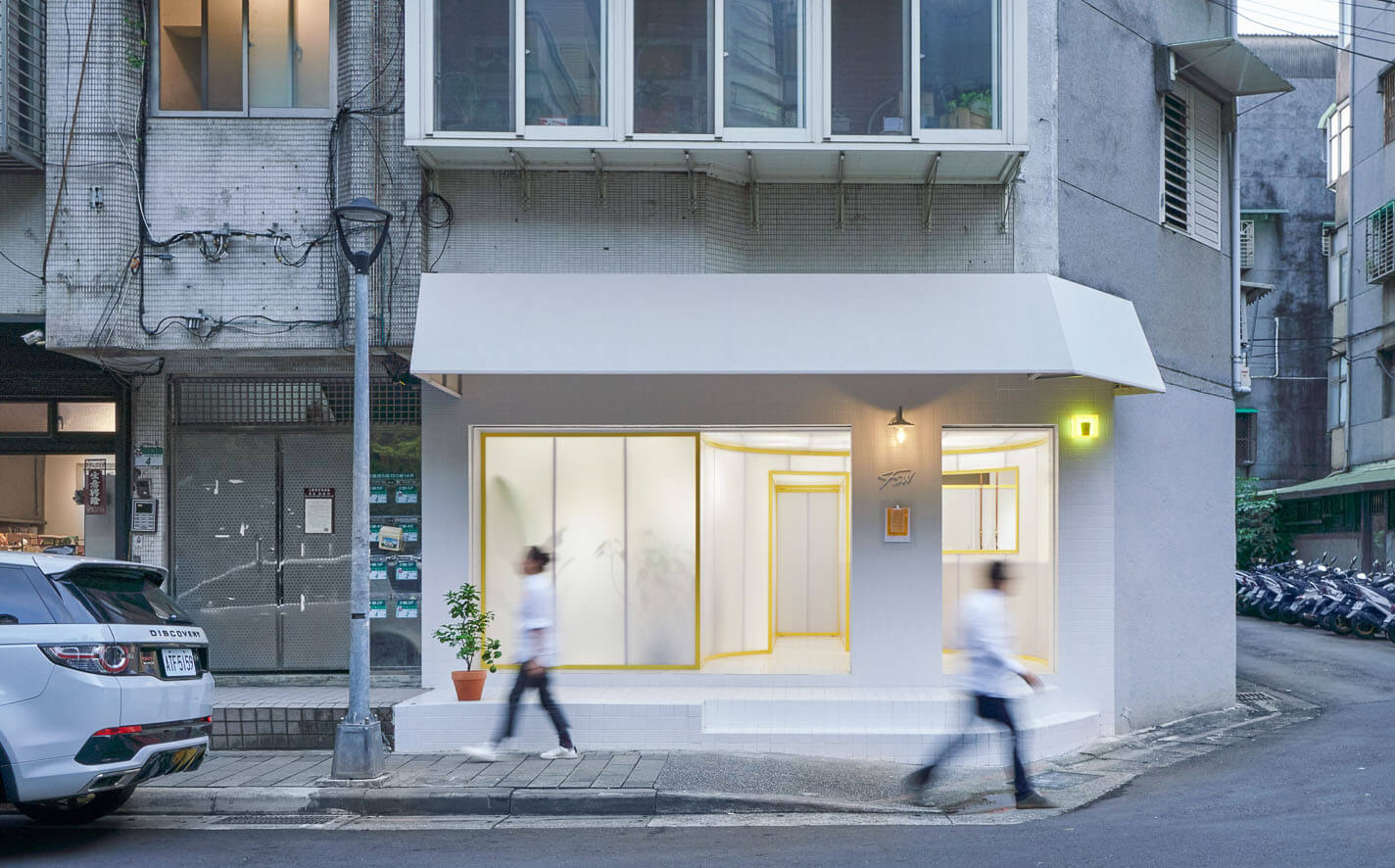
駐足店前,整齊劃一的磁磚縫與自由流竄的黃色鐵件線條,在半透的中空板的連結下,俐落的線條如樂譜般兼具理性與感性地構成內外空間層次。FSW 拾伍階工作室首間以社區咖啡實驗室概念打造的店面,在空間上透過由人行道延伸入店的釉燒磁磚將傳統市集與廚房那種現場作業、易於整理的鋪面應用帶入咖啡廳,在半透中空板的巧妙配置下,將店內咖啡製作與熱絡的咖啡聚落討論感染週邊社區與過路人。
除了線條與透明度產生視覺引導的趣味性,我們以特調黃色的代表品牌源源不絕的動能,也為社區點綴了新鮮感。此次設計帶出“介面”的轉換與銜接,磁磚與中空板也各自代表了傳統與科技感。呼應拾伍階工作室為銜接咖啡與社會所做的努力,期許這個空間成為咖啡與在地人文的介面。
Coffee industry has been in an unprecedented booming state locally and globally. This trending culture is supported by stories well told and fascinating presentations from serving, graphics to spatial design. Simply a cup of good coffee is not enough to for the retails to gain a margin given the competitive environment. Customers want ever fresh and diverse experiences while exploring shops. Our client, the shop owner and head barista of Fifteen Steps Workshop, enquired us to renovate his shop in a novel way to further boost his brand on the map. Spatial reinterpretation of the coffee roaster and shop tasked us at a commercially bustling district in Taipei.
Our site as an 80 sqm former office space at the corner ground floor of a mixed-use building is located on route to nearby trails from the CBD area of Taipei. Strolling around are businesspeople, nearby residents as well as casual hikers who approach the shop with very different mood and pace.
Concept / Design
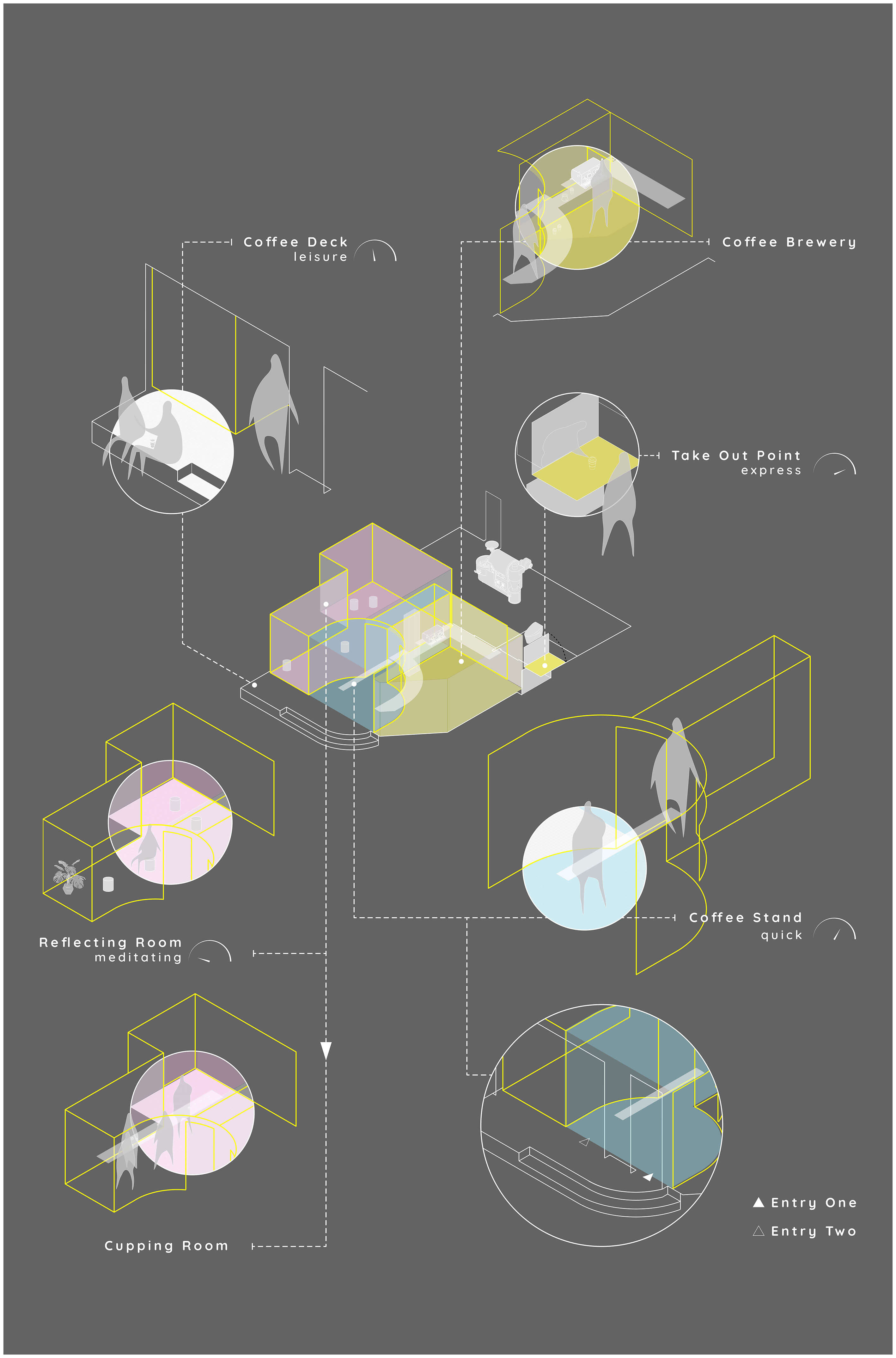
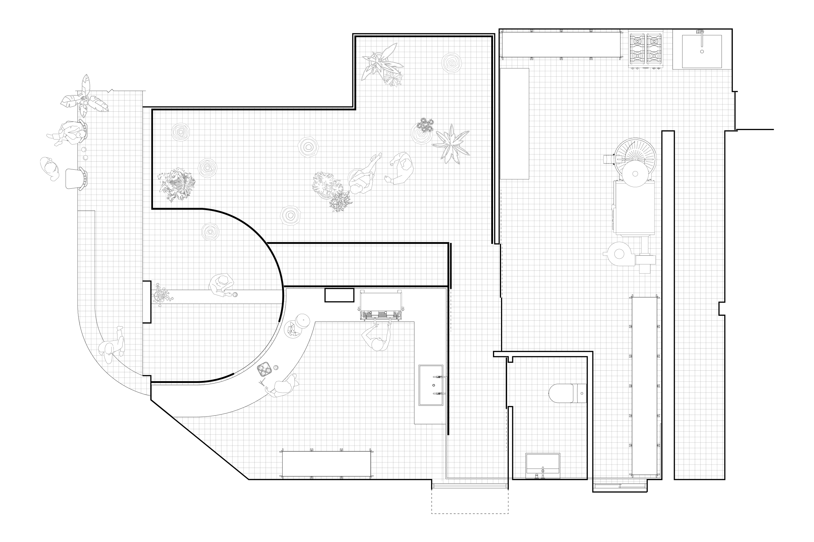
While most coffee joints did their best to showcase its interior and bustling scenes mostly with a rather open plan, our client intended to turn his shop into a quality quick serving bar with an on-site roastery and an invite-only space planned behind the scenes.
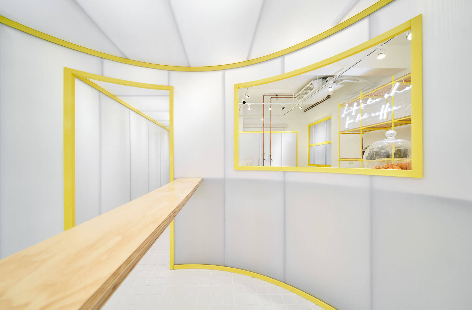
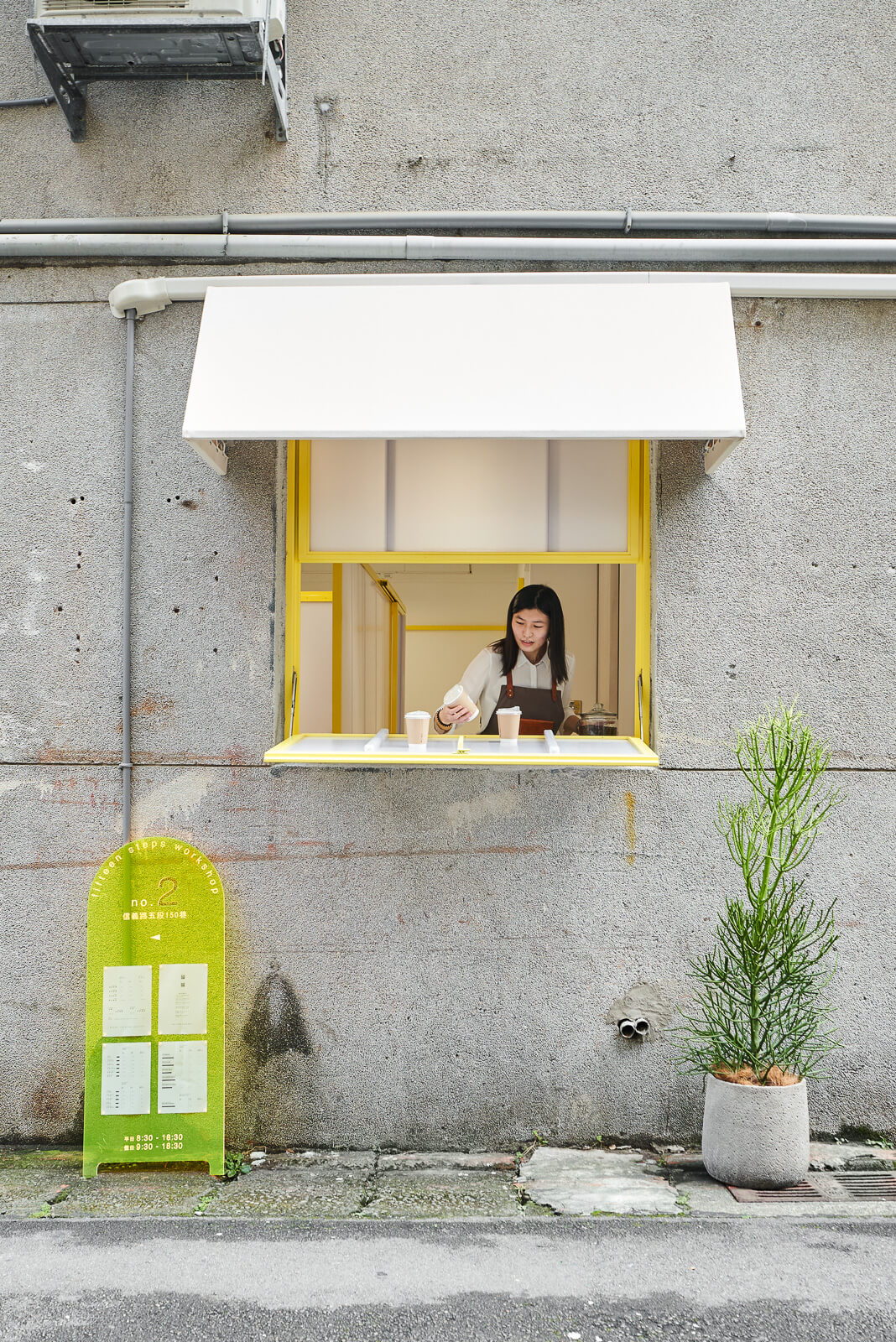
We divided the space accordingly and created a semi open carved-in area as a standing bar at the storefront which invites customers to step in and enjoy a quick sip, while the front steps and landing area adjacent to sidewalks welcomes a casual sit-and-drink. The intended open layout allows breeze coming down from the trail side to be an enjoyable feature along with the coffee aroma. As for environmental concern, the carved-in plan reduces the area of enclosed interiors which contributes to less AC usage. The layout also takes advantage of the corner location to create a takeaway window by the pedestrian friendly side lane.
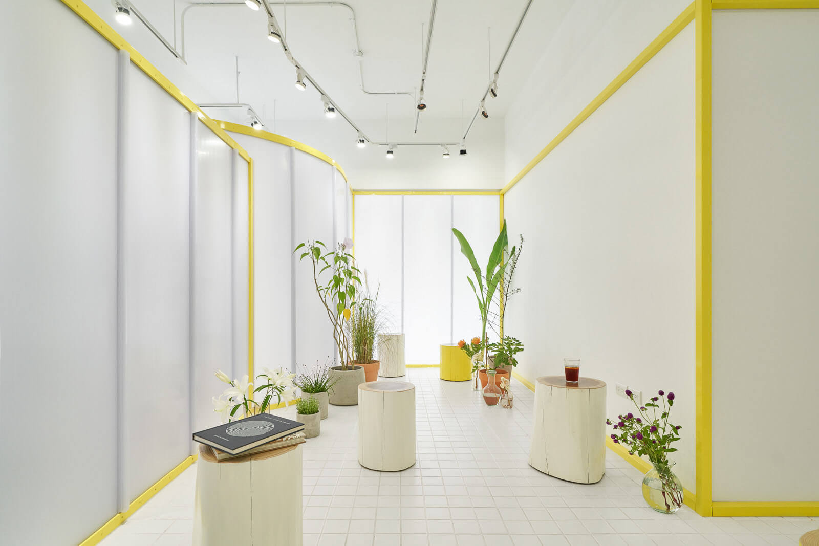
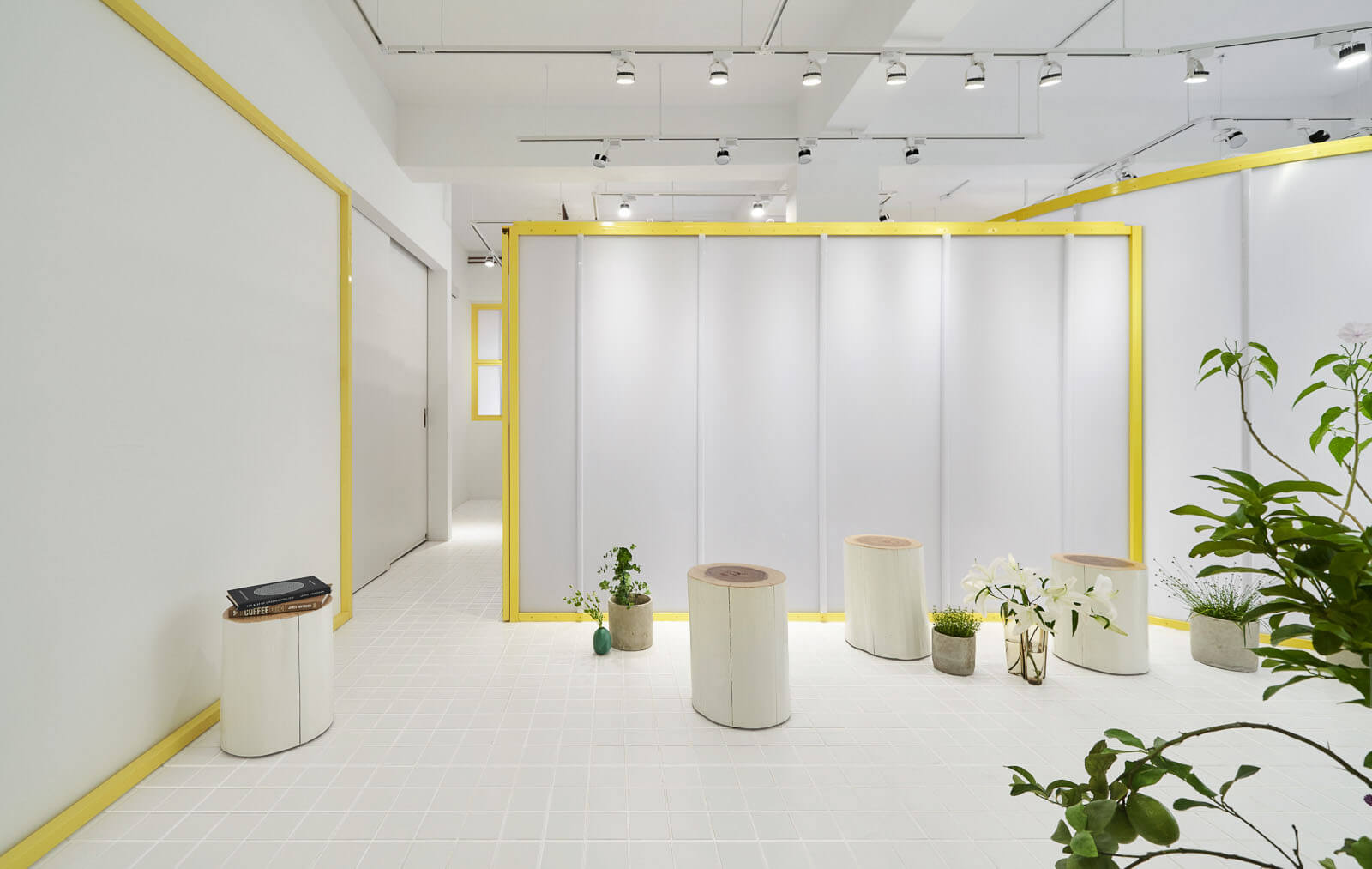
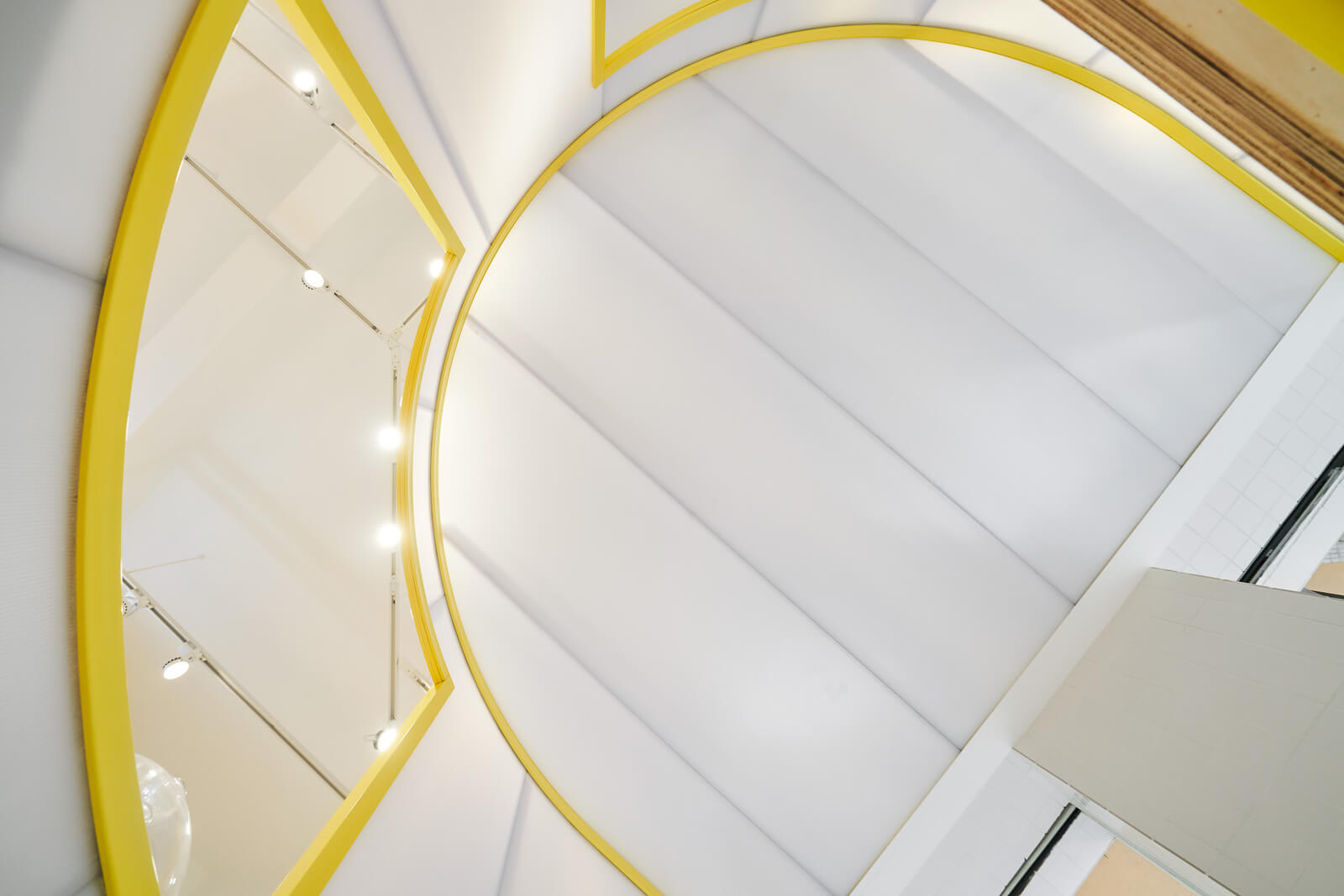
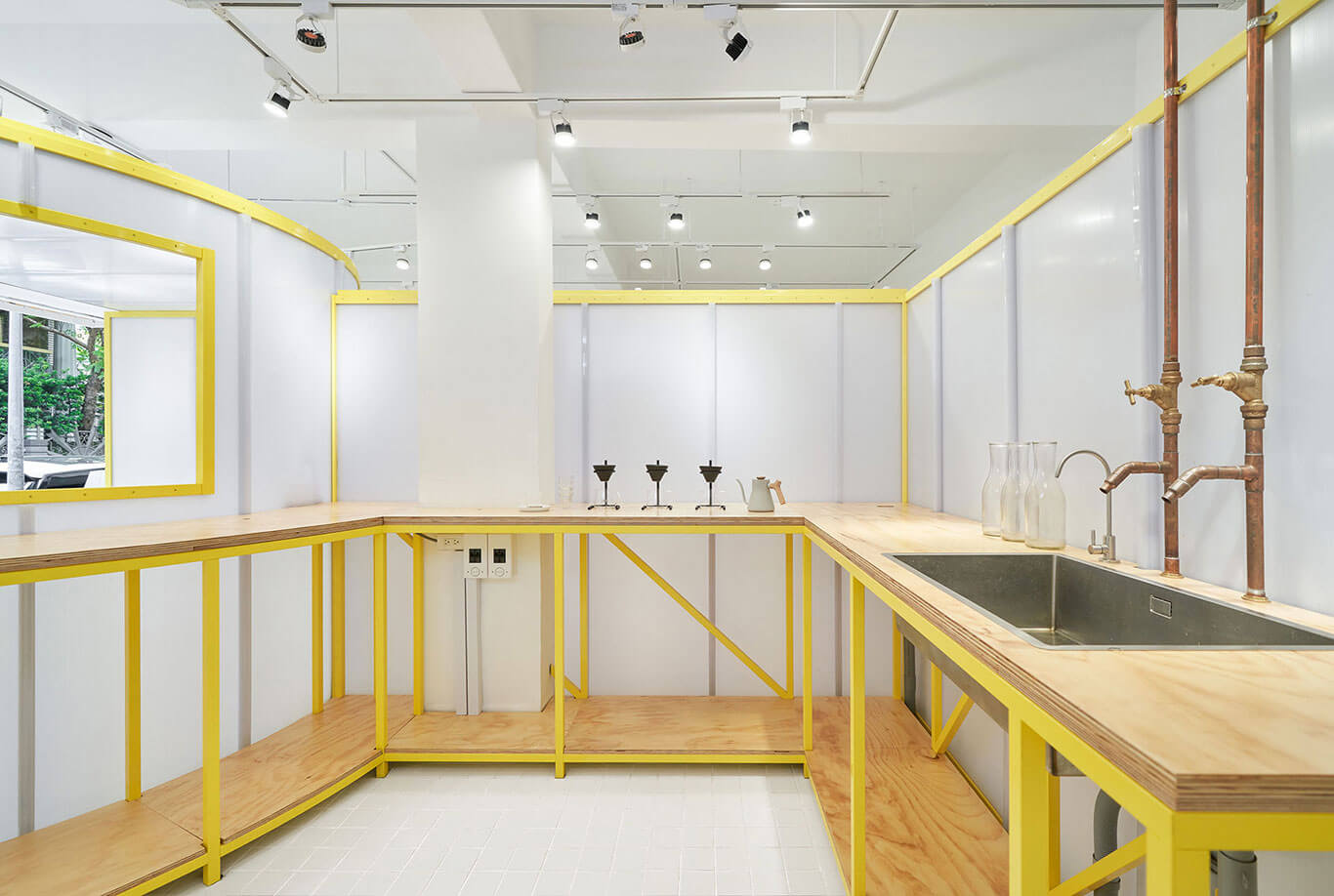
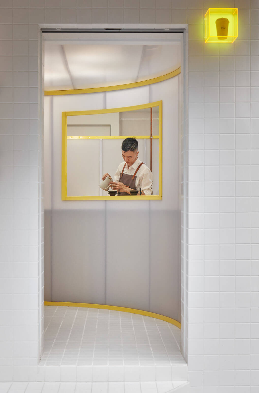
As a request from the client, the bar working area, the roastery and the multi-purpose room must be secured and invite-only with certain privacy. This tasks our design as we suggest the interior activities better be revealed rather than blocked. This is where sought-after materials come into play. We adapted polycarbonate panels with desired opaqueness framed with precisely fabricated painted steel frames as the main intervention which serves as spatial dividers and light diffuser for an incredible illuminating effect on both interior and exterior given different hours of a day. Given budget and regulation constrains, most area of the exterior finish was left untouched as a poetic contrast to our interventions.
The purpose of the multi-function room was better defined as we incorporated those light induced panels. Cupping seminar or lecture programs will be held from time to time with the activity vibes “revealed” to street passer-by via silhouettes and sound which is teasingly contagious. During the daytime, customers are invited inside to enjoy their coffee at their slowest pace. Indoor gardening is curated for a meditating ambience. Apart from enjoying the coffee at the standing bar or outdoor seating, another exceptional coffee drinking experience is served behind the scene.
The overall design gives a rational yet dreamy picture thanks to well reinterpreted materials and precise fabrication. We let the subtle elements do the talk. Light matters. Color matters. Translucency matters. Geometry matters. So do perceptions from taste bud to the sense of time.


